Manufacturer
Sustainability

We recently revamped TARKA’s booking system, allowing parents to schedule classes with ease and saving the team time on phone bookings. We enhanced TARKA’s brand and designed and build a new website for smooth integration with the new booking system.
TARKA is a premium exercise company for children, setting the bar high in fun and fitness. Their goal is to boost kids’ overall development. They teach military values in their classes, embedding essential life skills. No uniforms needed – unless, of course, it’s army party time. Then it’s ‘Ten-hut!’
Leo Bell, Managing Director, TARKA London
We spent time understanding TARKA’s challenges, their needs for the new booking system and potential workflow improvements. Their existing site made booking classes overly complicated. Parents regularly phoned in for bookings because the system was too difficult to navigate. Staff members were spending too much time managing bookings manually.
TARKA’s brand needed a spruce-up too. The guidelines were, let’s say, ‘free-spirited’. We aimed for solid, consistent branding that not only meshed with the new booking system but also turned heads in TARKA’s crowd.
The workshop also served as a platform to talk about our collaborative process. We discussed weekly meetings with Leo, the Managing Director for regular feedback and project tracking. We also promised TARKA to be there to sort out any misunderstandings, making sure we understood each other clearly.
TARKA wanted a self-service booking system that worked hard for parents and integrated seamlessly with their website’s look and function. Our goal was to give parents a single account to book multiple classes for multiple kids.
Our top recommendation was an off-the-shelf-ish solution that offered a seamless integration via an API – a tool that lets different software systems talk to each other. It would deliver an effortless user experience for both TARKA’s team and their customers.
When we presented a couple of options, TARKA opted for the sensible budget option. The right move for them. Pembee stood out as an affordable booking system offering an integrated iFrame (a tool to display content from another site within your webpage). That meant no need for complex integration work – it just ‘works’!
Pembee fulfilled all our criteria and seamlessly matched TARKA’s website design. The only hint parents have that they’ve landed on Pembee’s platform when booking classes is the change in the web address (URL).
We gave TARKA a brand glow-up. Colour palette sorted, typography tightened, logo spruced up. And with fresh brand guidelines, the website design followed a simple and premium structure.
Tech-wise, we kept it simple with the Pembee integration. Imagine this: a gateway on TARKA’s site, guiding parents to a one-stop place to find and book classes. The design? It was so smooth, you couldn’t tell it was a portal to another site.
We also designed a custom campaign banner. TARKA could set the destination for when parents clicked on it, speeding up bookings for specific sessions, such as holiday classes.
We didn’t want TARKA to feel lost with their new content management system (CMS). So, we made an easy-to-understand CMS guide, showed them around the system, and supported them during the user acceptance testing (UAT) phase – a step where they could try out the system to make sure it met their needs and worked properly.
Revealing TARKA’s updated site and the Pembee booking system integration was just the start. Instead of wrapping up, TARKA is continuing to refine their site, which we happily do in collaboration with their marketing agency.
We’re doing the heavy lifting as their personal tech consultants, translating all the jargon into actionable insights. For example, we introduced TARKA to A/B testing. We didn’t just mention it, we explained it thoroughly – like a wine tasting but for web pages. After outlining its benefits and how it can improve landing page results, we gave hands-on demos of the best tools for it, a practical lesson without any dull PowerPoint slides.
Leo Bell, Managing Director, TARKA London
TARKA is already celebrating victories post-launch. With parents taking full advantage of the self-booking system, the phone lines are blissfully manageable.
The website is smoother and more welcoming too. We put the site through the digital equivalent of TARKA’s boot-camp workouts for kids and found that mobile performance sprinted ahead with a relative increase of 93.18%. Critical for the busy parents who book classes on-the-go. Meanwhile, the desktop experience increased by 18.53%, and accessibility leaped up by 48.08%.
Leo Bell, Managing Director, TARKA London
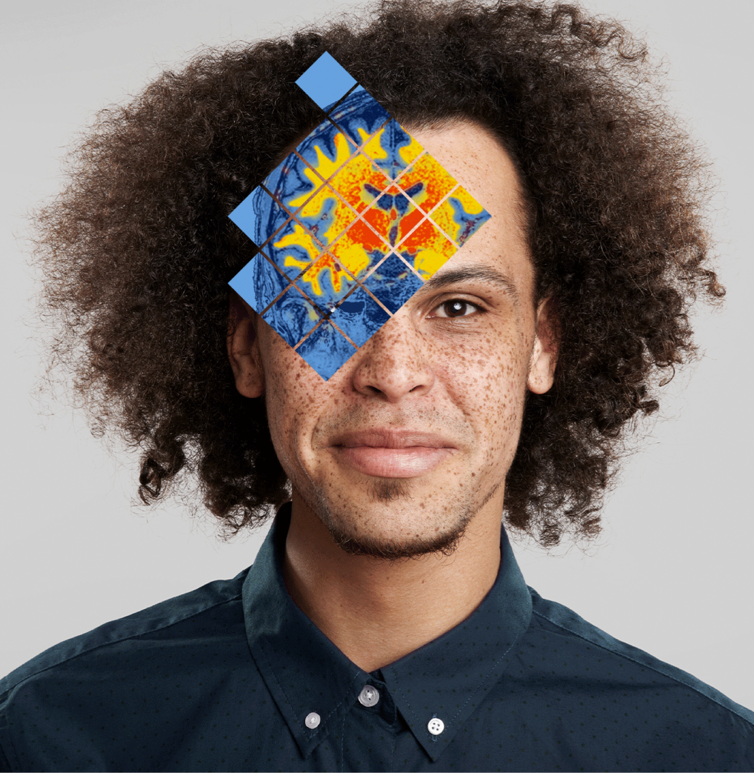
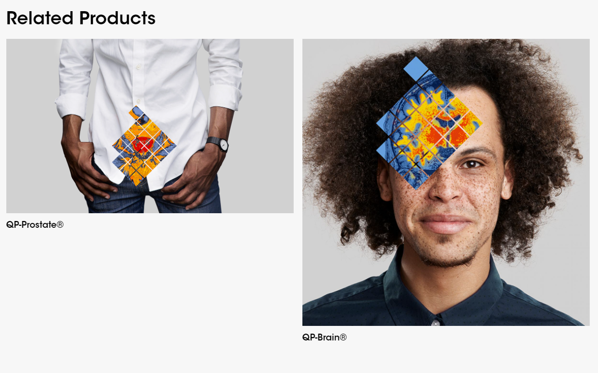
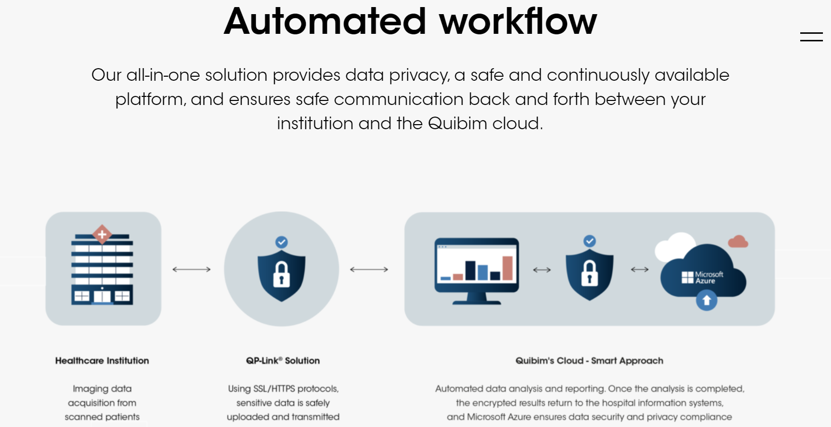
Quibim, a cutting-edge med-tech firm, uses Artificial Intelligence (AI) to decode intricate medical imagery. They’re the Sherlock Holmes of the medical world, interpreting the mysteries of X-rays, MRI scans and beyond. They transform these insights into precision diagnoses. Delivering essential knowledge that paves the way for life-saving medical decisions.
Quibim’s website just had a complete Telescopic overhaul, capturing the essence of this forward-thinking, people-centric med-tech company. With a perfectly shaped custom configured content management system (CMS), we handed Quibim the reins of their content. And wait till you hear about the cunning plan we hatched to shift their blog content without a hitch.
Assess
We spent time understanding Quibim, their audience, goals, and website challenges. Their old site didn’t reflect Quibim’s advancements in AI-driven medical imaging. Our key objective? To design a fresh, flexible website that communicates their expertise and influence in the industry. It also needed to emphasise their human-first approach. Driving trust and connection, while making them appealing to investors.
As a rapidly evolving company like Quibim, they also needed a site that could be easily updated by their internal team of creatives and marketers. They had a wealth of blog content too. The content required secure migration to the new site, while retaining search engine optimisation (SEO) value.
Plan
Quibim set us a one-month deadline for the website project. One month? Sounds like a walk in the park… if the park was filled with tightropes and fire-breathing dragons. But hey, we love a good challenge.
To launch the website swiftly, we chose the essential pages to build first in phase one of the project. Our plan was to incorporate dynamic visuals and improve the user experience (UX) for a living, high-tech feel. We also decided on WordPress, an open-source content management system (CMS), to build a flexible website.
For the content migration, we planned to automate most of the process, reserving the manual effort for the spotlight pages. The content migration strategy also included automatically assigning 301 redirects for search engines to make sure Quibim’s SEO value stayed rock solid.
Execute
Our digital design infused life into Quibim’s homepage. We introduced several dynamic elements to the site: videos featuring people, code-driven animations and subtle scroll-activated elements. This blend of media, set against a shifting dark blue gradient, brought the science of their work to the forefront while keeping the human imagery intact. Enhancing the overall site appeal and preventing it from feeling too static.
The design and build were approached in a modular way using WordPress real time preview editor – each content element was crafted as an individual, bespoke module. These modules can be arranged in any order to form a page, giving Quibim the freedom to easily update or create pages. This way, Quibim was freed from “developer dependency disorder”.
As we shifted to a new content management system (CMS), we automated the transition for most blog posts and news updates. Key pages received manual attention. Each chunk of content was carefully moved from its old home to a new module on the revamped site. We also set down 301 redirects. They guided search engines from old web pages to new ones. This made sure none of that hard-earned SEO juice got lost during the site move.
Maintain
Think of us as the mechanic to Quibim’s high-performance sports car. We’re always on hand, fine-tuning their website engine after launch. And making sure it doesn’t stall on the digital highway.
But that’s not where the collaboration ends. When Quibim has a spark of a new idea or a request for changes to the site, we don’t just hop to it. We hit the pause button, huddle up and brainstorm. Our goal is to find the smartest way forward, not just the quickest. Once we’re loaded up with fresh ideas, potential tweaks, and a buffet of solutions, we take it back to Quibim.
This is a dialogue, not a monologue. We’re working with a mix of creative folks and project managers, so clear, accessible communication is key. We lay out the different paths, required resources, and our recommended route. This way, we all stay on the same page, handcrafting the most polished digital reflection of Quibim together.
Quibim’s new website echoes the progressive company they’ve grown into. It’s a head-turner for their current investors and siren call for future ones. But wait, there’s more … cue infomercial music.
Before Quibim’s website’s revamp, it was scoring just 18% for mobile performance and 56% for desktop. Accessibility? An average 57%. Post-makeover, the change was clear.
Mobile performance saw a significant increase of 47%, and desktop performance rose by 29%. Accessibility also experienced a 17% improvement. The new Quibim site doesn’t just look good, it’s now a lightning-fast, user-friendly platform.
Remember, users form an opinion about a site in a mere 0.05 seconds. And almost half will bail if a page takes more than two seconds to load. So, these improvements aren’t just stats. They mirror a satisfying user experience that matches Quibim’s high-tech ethos.
Quibim’s new website is also more sustainable, producing only 0.15g of CO2 each time someone visits the home page. That’s way less than the 1.76g most pages churn out. So, while maintaining Quibim’s tech-savvy and scientific vibe, we’ve crafted a site that’s not just user-friendly but planet-friendly too.
Let’s work together. Get in touch.
British Fencing (BF) is the National Governing Body for the Olympic and Paralympic Sport of fencing. It serves the wider BF community — fencing athletes, clubs, coaches, referees and countless volunteers.
BF believes that fencing is for everyone. It’s focused on making the sport more accessible, inclusive and diverse. For instance, it collaborates with schools, learning centres and other activity venues. Together they’re introducing kids to fencing who would have otherwise struggled to engage with the sport. They benefit from gaining new skills, building their confidence and learning how to think independently. In this sense, fencing helps them deal with life’s challenges and be happier individuals. It’s one of the many ways BF is driving social change through its programmes.
British Fencing engaged with us in March 2020 looking for help with an app — Explore Fencing. The product had been started by another agency before we arrived on the scene.
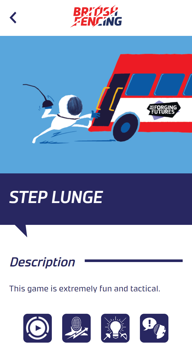
The Explore Fencing App was supposed to be a free-to-download interactive asset. One of its purposes was to introduce fencing to beginners through fun games. Each game would come with a description, a how-to guide and a video showing users how to fence. It would be an engaging way to make the sport less daunting and more accessible for those interested, while supporting community fencing coaches’ onward delivery to over 250,000 unique fencing participants each year.
The app was also designed for BF’s Licensed Partner Programme and their coaches, such as activity centres like Centre Parcs or We Are Forging Futures schools. Their version would be paid and they’d get access to premium content, such as teaching materials. Coaches would also have the ability to tailor the content for their uses. This was how BF intended to commercialise the app – by distributing paid-for content.
But the app wasn’t fit for purpose. As James Craig, Commercial Director explains, “From a backend perspective, it was buggy and inefficient. Simple actions, such as adding new content to the system, were extremely time-consuming. We weren’t as concerned with the frontend, but it wasn’t as modern as we had hoped.”
BF needed help fixing the app to make it publishable in iOS and Android app stores. To turn the product into a valuable asset, we first explained our plan. It was approved and we launched into action.
The code was riddled with bugs. We addressed them first-, so the app worked for all users. No more error messages or searching for fixes and workarounds. With a better, bug-free code, the user experience at both ends became seamless.
Then we rebuilt the app with a monorepo — one efficient code source for different platforms. Not only could BF now publish in iOS and Android app stores but it could deploy the app for the web. This new functionality enabled classroom use, further adding to its value.
Click here to check out the Explore Fencing app
We also helped BF with things like manual data imports. For instance, previously it would take app administrators dozens of clicks just to create a new user and assign them to games. Now it takes three.
We turned the app into a mature product. But our work wasn’t over. BF needed to easily create, edit and publish content on the Explore Fencing App. An effective content management system (CMS) would generate a new revenue stream for BF through paid-for content that was valuable to fencing coaches.
There was an existing function for this purpose – a .exe packaged windows application. It was tedious to use. Initially, we helped BF navigate it as best we could. But every time we encountered a bug that needed fixing, another would appear, so we made the mutual decision to build an online CMS.
Now, things like drag-and-drop functions and shared online access mean users can easily manage and distribute content. It also lets coaches add, edit and publish content, facilitating a more personalised experience. On top of the online CMS, we’re also making the app API-ready which opens up the future for exciting developments.
The Explore Fencing app project marked the beginning of a new partnership. To kickstart a rewarding relationship, we hosted a workshop with BF to assess its digital estate, how it operates and the types of systems it’s using. We’ll also build on our knowledge of BF’s purpose and long-term goals. From this, we’ll create a practical digital roadmap on how to help our client grow and improve. And, as always, we’ll explain the WHY behind our recommendations, keeping them fully informed every step of the way.
We’ll take the fluffy bits of a digital strategy and help implement it with practical no-nonsense solutions.
BF clicked with us, as James puts it:
“Telescopic went above and beyond the original scope,” James says. “I think that’s their default. Even if they finish something ahead of schedule, they’d be proactive in saying: Is there anything else we can help with? It’s not often you get to work with people so committed and proactive.
“The team is also very diligent,” continues James. “They use quality software for communication and always get back to you quickly. We were never left wondering what was happening with the project. And crucially, they put the effort in to make sure you understand the technical side of things. There wasn’t anything we didn’t get or weren’t prepared for.”
Watch the video below for more insight into James’ experience working with Telescopic.
Technology doesn’t have to be your forte. You can still wield it like an Olympian fencer with expert support. Sharpen your competitive edge and drive growth by engaging with us. (Ok, we’re going to stop now.)
We’ll connect you with tech that serves you and secures your success.
Call us on 02036331575 or email us at hello@wearetelescopic.co.uk.