Charity
Education and Childcare
Nonprofit organisation

St Margaret’s is a hospice based in Somerset, caring for individuals aged 18 years and above facing life-limiting illnesses.
The hospice is known for the strong, personal connections they build with the people they care for. But behind the scenes, disconnected systems and outdated tools were making that work harder. Staff spent too much time chasing information, slowing down their fundraising efforts.
St Margaret’s struggled with their incumbent CRM system. Reports took forever and income tracking was painful. It was hard to see exactly what data they had and whether it was GDPR-compliant. This made fundraising harder and added unnecessary stress.
Face-to-face conversations with the team and senior leaders helped us get a clear idea of how the new CRM needed to work. It had to match their day-to-day processes and support clear, accurate reporting for funders. They needed tools that fit how they worked – not a generic system.
Every detail was mapped out to make sure the new system worked in practice, not just on paper.
Data capture and storage were shaped to help teams work together more easily. The system was kept simple so everyone could use it, even those less confident with tech.
The finance team needed to track income for reports and audits and pass that information on to the accountancy team without confusion. The plan made sure this would be smooth and reliable.
A phased approach helped keep things stable while large amounts of data were transferred. This gave staff time to adjust and reduced the risk of setbacks.
A first version of the new system was set up, with all the important information clearly organised so nothing would be missed. St Margaret’s had been on the incumbent CRM system for more than 20 years! A steady hand was needed to migrate everything correctly. Breaking the migration into smaller steps also made it easier to ensure GDPR compliance (by standardising consent across data from various sources and ensuring that the gathering and recording of consents was robust and auditable)
A pilot group tested the system first, identifying opportunities for enhancement, before the full migration. Then the entire database was moved over, with face-to-face training easing the transition for everyone. Each step was explained clearly, so staff felt confident and not overwhelmed by the change.
St Margaret’s now has a clear view of all fundraising data. They don’t wade through spreadsheets or wonder if records are up to date. Income tracking is straightforward, and reporting takes a fraction of the time.
Staff can see exactly who has donated, when and how that fits into each campaign, with their new CRM, Beacon. This means they can plan new fundraising efforts with confidence. Sensitive data is compliant with GDPR which removes the stress of unclear or outdated records.
The hospice team feels more in control. Day-to-day admin is easier and they have more time for what really matters: providing exceptional care to those who need it most.
"Telescopic supported our Hospice through the configuration and implementation of a new CRM after 20+ years of using an outdated legacy system. The team were brilliant. Responsive, insightful and expert in their advice. They made a culturally difficult project accessible and inclusive and helped alleviate colleague worries during a considerable change management process. A pleasure to work alongside and nothing ever felt like too much trouble, despite some of our strange requirements!"
Joanna Hall, St Margaret’s Hospice Care
Tight budget? A limited timeline or any other obstacles preventing you from moving forward? We’re here to get you unstuck!
CoppaFeel! is a breast cancer awareness charity based in London. They educate young people about breast cancer signs and stress early prevention. Events like marathons and self-owned creative challenges give individuals countless opportunities to raise money for charity.
CoppaFeel! were using an old CRM they’d grown organically – but it had become disorganised.
It lacked key functionalities for supporter tracking, making it difficult to generate useful reports. Various teams relied on separate spreadsheets, leading to data fragmentation and GDPR risks.
They had to use data better in fundraising, finance, event planning and engaging supporters. Making their processes smoother and working better together was crucial to get more done.
Different teams had splintered knowledge of supporter activities. This made it difficult to manage high-profile supporters effectively.
The first step was to organise and make data easier to use. This would help them raise more funds and work faster and better.
Since the new CRM was a big change, leadership support was needed to ensure a smooth transition. We worked closely with the internal project lead and the head of fundraising throughout.
The planning phase involved workshops with all teams to map out current processes and identify improvements. This helped us create a clear plan that aligned with their needs.
We started with detailed documentation, outlining process flows and how all the data would work together.
We also provided e-learning resources for the CoppaFeel! team. Having them familiar with the platform prior to launch helped smooth the switch-over and avoid simple errors early on.
The CRM was configured to:
Once the system was set up, we conducted pilot testing, gathered feedback and made any refinements.
For the data migration, we worked with Coppafeel! to understand what data was important to retain on the new CRM. Broadly, this resulted in retaining data from the last 5 years and over 350,000 records being migrated into the new CRM. Challenges like these are what we’re built for. We made sure the process was smooth despite the scale.
CoppaFeel! also opted for a hard switch-over, decommissioning the old system on a Friday and launching the new one on Monday.
Their team celebrated with a launch party, which built excitement about the changes. They kindly invited us, and we hosted a drop-in clinic where people could pop in and ask any questions about the CRM.
We also helped CoppaFeel! hire a database administrator. Someone in-house who would take ownership of the CRM. We held a detailed training session with them and a few others who’d be CRM admins.
Our work with CoppaFeel! hasn’t stopped with the CRM launch. We’re currently working with them to plan, source and configure a volunteer management system. A place they can house all self-directed volunteer activities. This will sit outside of the overall CRM, but plug in, so everything marries up together, avoiding any future data silos.
Disorganised spreadsheets are long gone. CoppaFeel!’s new CRM system has improved their ability to fundraise and connect with supporters.
Now, their team can streamline all fundraising touchpoints. This will help them improve their services and make even more strides in the fight against breast cancer.
"Telescopic supported CoppaFeel! through a smooth CRM transition to Beacon. They engaged the whole team, ensured buy-in, and communicated clearly throughout. Their professional, friendly approach made the process far easier and more collaborative than I could have hoped for."
Henrietta Atkinson, Operations Director, Coppafeel!
Tight budget? A limited timeline or any other obstacles preventing you from moving forward? We’re here to get you unstuck!

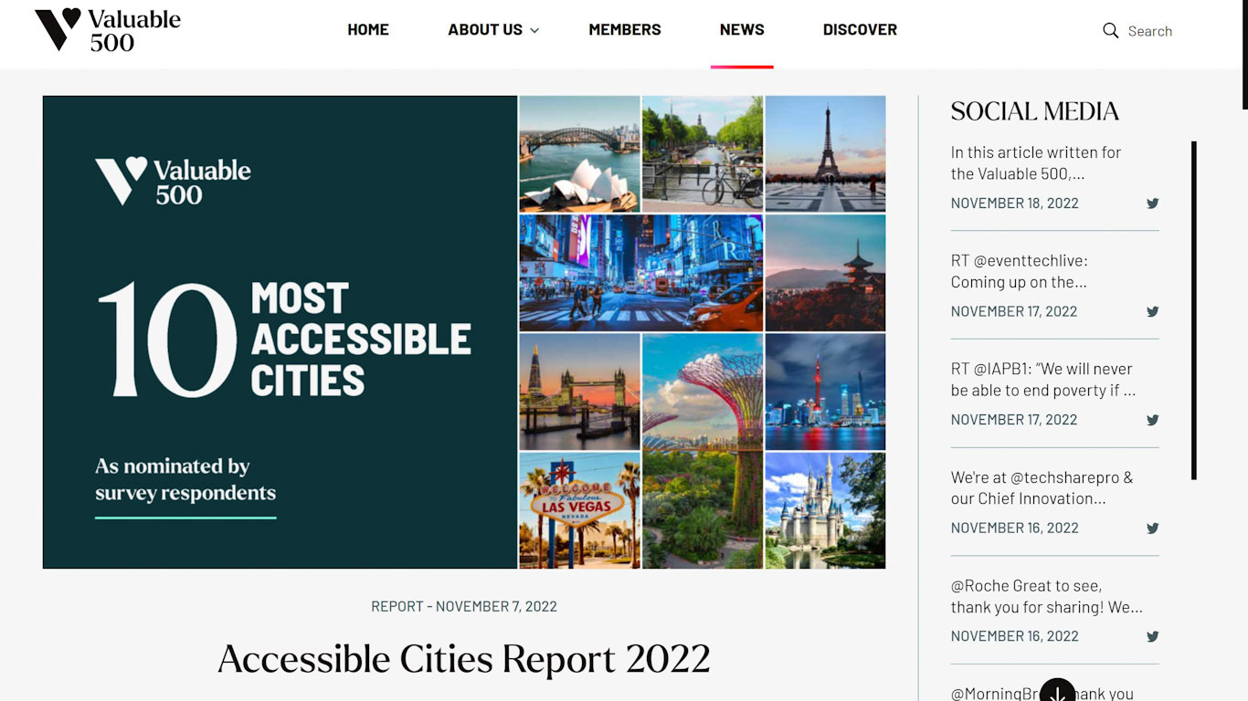
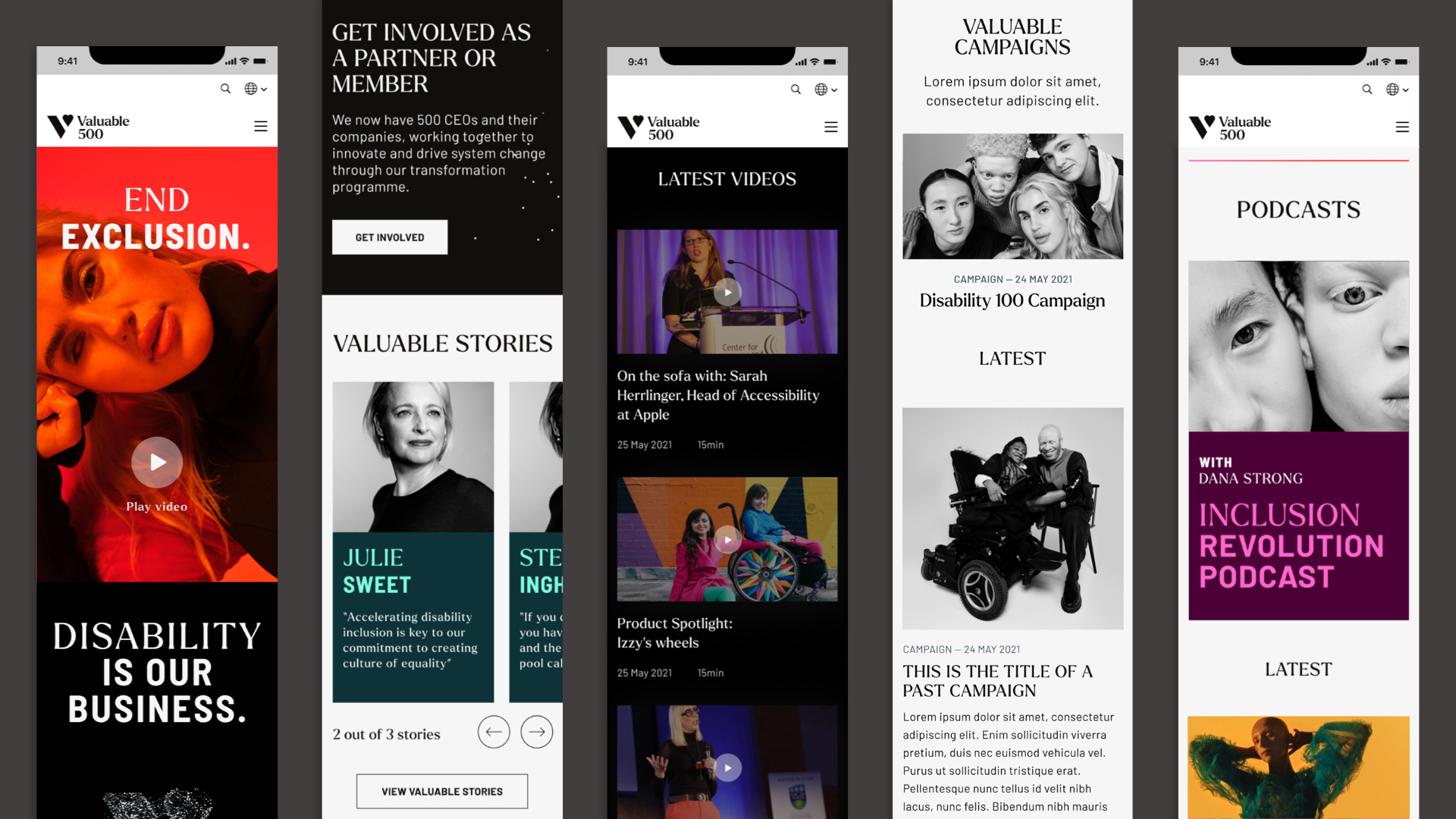
Valuable 500 is a global collective of 500 CEOs and their companies, innovating together for disability inclusion. Its aim is to recognise the unique value of the 1.3 billion people living with a disability, connect with them and build a more inclusive society.
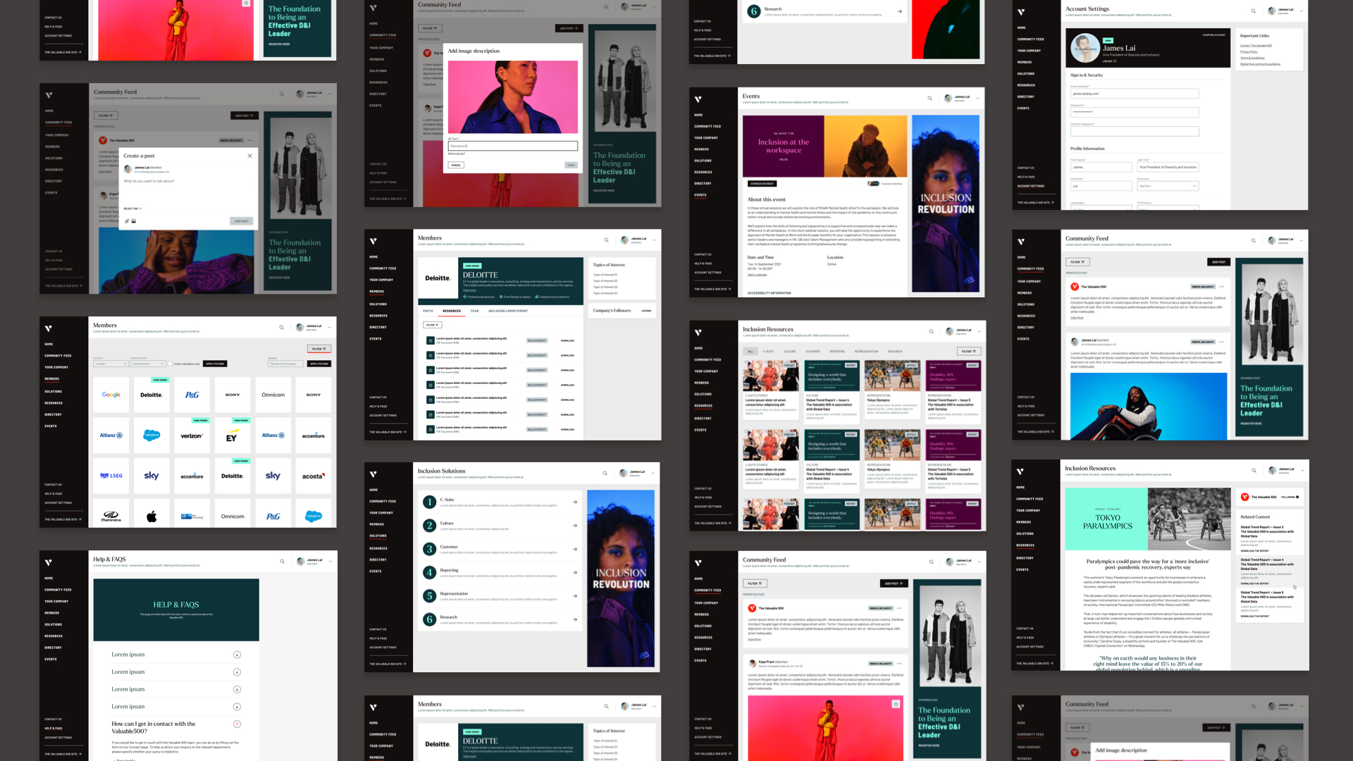
We teamed up with brand consultancy Saffron to plan, develop, test and implement a range of accessible products that would form the core of the award winning nonprofit website and the Valuable 500 digital portfolio.
Turns out its not just a triumph of accessibility, but also great for our SEO! *Throws in another mention of being an award winning digital agency in London*
We wanted to create an environment for The Valuable 500 that helps them to end disability exclusion by uniting people to spark action and accelerate change. Our task was to help them connect the leaders of the world’s most influential companies, D&I teams and people with disabilities, creating an inspiring digital ecosystem capable of fostering inclusiveness.
This ecosystem would comprise:
A web-app for Valuable 500 members, where they could find all the tools needed to fast-track their disability inclusion journeys. This platform would also help members build connections, share knowledge and ultimately accelerate change through access to resources, events and D&I specialists.
A public website would showcase the latest global trends, news and innovations regarding disability and inclusion. It would provide a platform for inclusive conversations to raise awareness by giving access to information for everyone and act as one of the main touchpoints for The Valuable 500 to express and bring to life their brand, purpose and mission. The platform should also include a section for the disabled community to get their voices heard.
Working as a multi disciplinary team, we assessed the full spectrum of requirements and established a blueprint for delivery. This included iterative wireframes, user stories and technical specifications. We defined the initial elements of the platforms, how users would interact with them and mapped public-facing and back-office functionality. We selected a tech stack which would provide a robust foundation, whilst offering flexibility and scalability as the sites and their audiences grew.
Implementation included configuration of a highly flexible, modular CMS to manage complex content requirements on both the public website and the private members app, and which provides capacity for scaling. The system integrates with the Microsoft Dynamics CRM to manage members details efficiently and provide one source of truth for The Valuable 500 members data.
We worked hard to make The Valuable 500 digital platforms accessible to every user and on every device. Working with our partners from Crownpeak (previously Ilumino), these products have been tested and optimised to make sure that usability extends to every audience. The result is our most accessible build to date! The CMS gives The Valuable 500 the tools to create and edit highly customised content, whilst remaining fully accessible.
Since going live, we have continued to provide vital support to The Valuable 500 team. From being on hand to address technical challenges to enhancing core functionality based on user feedback, our Maintain service gives The Valuable 500 the peace of mind to scale & succeed with their digital presence.
But becoming an award winning digital agency was never the goal – it’s just great for our marketing team and the SEO! But we’re already busy, working hard on version 2.0 to ensure The Valuable 500 are supported all they way to SYNC25.
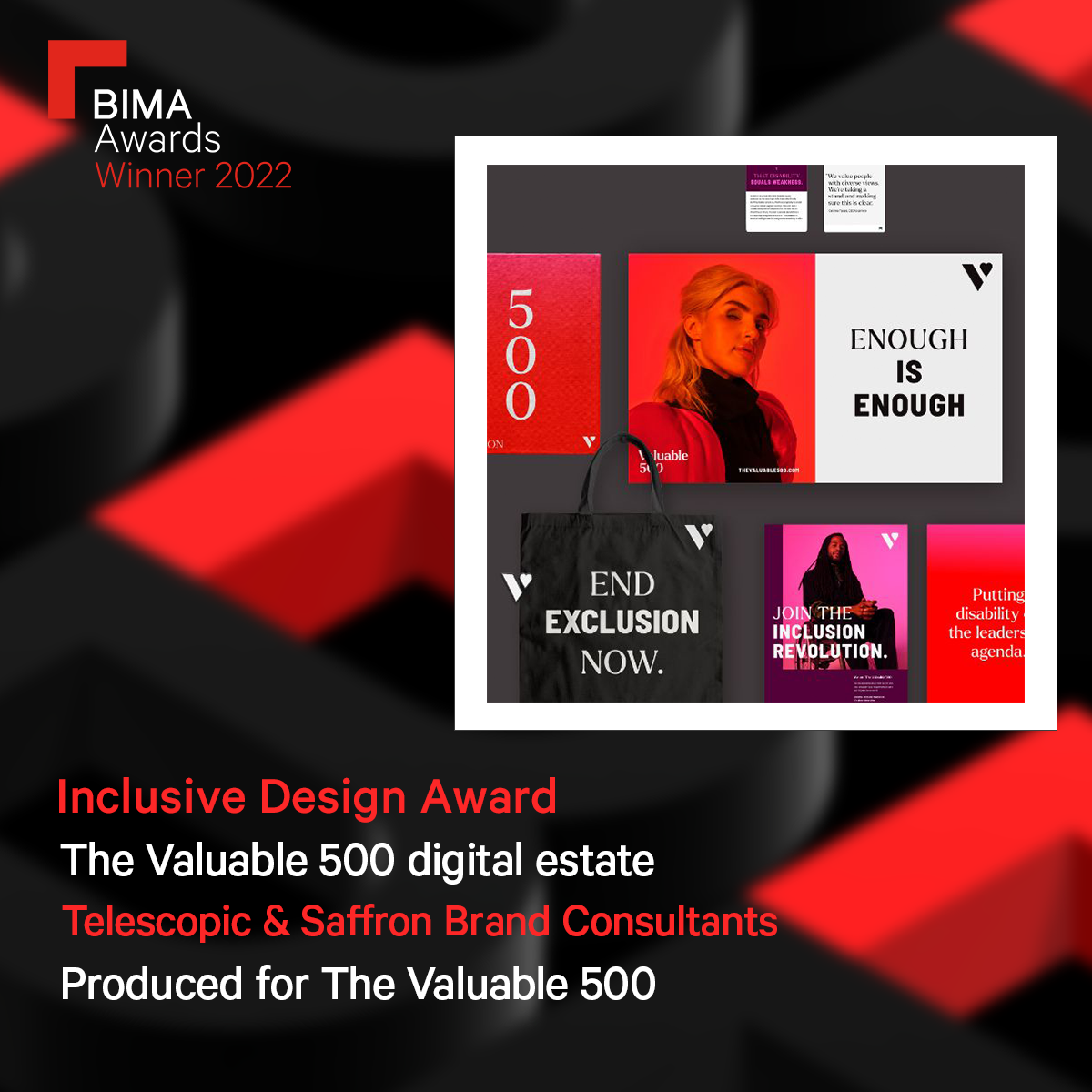
We were delighted to receive a BIMA (British Interactive Media Association) Gold award – alongside our partner Saffron Brand Consultants – for our work on the Valuable 500 digital estate.
Across The Valuable 500 members, 81% of companies reported that they were better placed towards making progress in disability inclusion than a year ago, having engaged with the available online resources and the business network.
Some of the world’s most influential brands have joined The Valuable 500 collective, including Apple, Google and Microsoft.
Mary Keane-Dawson, BIMA Awards 2022
Tight budget? A limited timeline or any other obstacles preventing you from moving forward? We’re here to get you unstuck!
Fischbacher 1819 is a leading Swiss textile manufacturer with a history dating back over 200 years — all while embracing modern technologies and leading the way in sustainability. The company is known for its high-quality fabrics and innovative designs, which are used by interior designers, architects and other professionals around the world.
Telescopic teamed up with Christian Fischbacher in 2016, initially to fix up a website that was part of a relaunch.
Since then, we’ve consistently supported the team with ongoing system updates, fixes and fresh digital perspectives. We’ve completed two replatforms and combined multiple systems and data sources. The recent rebrand to Fischbacher 1819 was a great opportunity to (again) review the effectiveness of their current setup and come up with new ideas. And to transition from a complex platform that is becoming obsolete and buggy to a fresh start.
Sometimes it’s tempting to throw everything away and start from scratch — but in this case, we didn’t want to throw the baby out with the bath water!
We’re now helping to prepare Fischbacher 1819 for future advancements, marking a rewarding milestone in our eight-year partnership.
A redesign to celebrate the brand’s over 200-year history provided an opportunity to reassess the website’s purpose, user groups and structure, making sure it works as efficiently as possible for the company.
The first objective: release the new brand rapidly while reviewing and upgrading the website’s underlying systems.
A full replatform is always a painful process, and ensuring a thoughtful approach was essential.
Because the website supports daily activities behind the scenes, not just serving as the business’s face, we quickly devised a clever strategy to meet the brief and efficiently plan a full replatform — but implementing this in carefully planned stages to minimise any disruption.
The opportunity was clear: modernise business processes (which is no mean feat for an international distributed team in a 200-year-old company!) while automating labour-intensive tasks and integrating product management systems more effectively.
We started with a thorough assessment of the current setup, working with the leadership team to establish goal setting and vision planning.
We evaluated current business priorities, user groups, current tech stack and presented possibilities.
A multi-staged plan encompassing every step of a replatform, timed to allow a quick rebrand release.
Here’s what the full plan entails:
The goal is to make the Fischbacher’s team’s life easier and provide up-to-date information to customers worldwide. It gives customers what they expect from a leading textile company like Fischbacher 1819: a seamless and satisfying experience.
Phase one of the website redesign prioritised user experience with a focus on the main user groups, improving navigation and opportunities to highlight content on the homepage. These upgrades were key to allow the marketing team to generate fresh and relevant content while allowing for experimentation.
The key was the underlying technology solution: by using flexible building blocks within the old system, we managed to quickly apply a new brand onto a very complex system while keeping the old tech in place and avoiding complex data migration during the brand refresh.
This meant we could focus on one key issue at a time.
Subsequent implementation phases will move the remaining legacy pages and functionality to modern platforms over the span of several months. All invisible to the end users.
The new build focuses on showing content that matters most to Fischbacher 1819’s key customer groups. This includes incorporating more flexible calls-to-action so the website provides relevant content and easy-to-reach information.
Automated translation tools in the new CMS make the marketing team’s day-to-day content management easier and more efficient.
We’ve successfully managed a tight deadline to improve their website and we’ll continue to support the business operations through this crucial next phase of their digital journey.
This project shows how powerful it can be when companies like ours and Fischbacher 1819 team up, sharing the same values and aims.
This ongoing collaboration means we’ll keep making targeted improvements. Approaching a project as a business objective rather than a one-time task shifts the focus to ongoing enhancement instead of quick fixes and shortcuts.
As we move forward, Fischbacher 1819 will continue to stand out as a leading global textile company that customers choose and trust.
Tyler Grange stands out in the world of environmental consultancy. As a B Corp, they combine ecological, arboricultural, and landscape planning expertise with a commitment to their team’s wellbeing. They’re inspirational with their productivity and wellness strategies, including the 4-day work week. We hope to tread a similar path soon as their focus clearly results in happier staff and enhanced client outcomes.
Simon Ursell, Founder and Managing Director at Tyler Grange, wanted a clear way to check how tired or happy his national team was. Particularly vital for ecologists, whose job can often be, “Drive to the middle of nowhere when everyone else is asleep and assess the wildlife.”
A data tracking app was built by a close contact. The app was in a good state when we got involved. It simply needed technical polish. But there’s more to this story, as we discovered when Simon asked for our help.
Simon introduced us to the computer scientist who developed the app. This close contact had collaborated with a British Airways pilot – an expert in sleep science. They had created the app using a NASA method (yes, of course, we love space ships) for tracking fatigue and happiness.
We ran several workshops with them to learn more about the app and its purpose. The aim was to evaluate the effects of changes, such as the 4-day week, at Tyler Grange. It was also about getting the app market-ready to share it with other businesses. This enables them to use it to positively impact their business and industry.
Critically, we discovered that the big issue wasn’t the app. It was dealing with the info after it was entered. All the data was dumped into a huge spreadsheet. The data needed to be organised for easy pattern spotting. Differences in fatigue and happiness needed to be clear across specialisms, offices, and months. Tyler Grange needed an easy way to sort and share this data, without spending lots of time on manual data entry.
We also needed to shield individual inputs while allowing the broader team data to emerge, ensuring Tyler Grange could discern team-based patterns. We suggested using a technique called “hashing”: think of it as giving a secret numerical alias to names. For instance, “Alex” might become “8472” – the number tells nothing about Alex, keeping their input anonymous. So, even a peek at the data reveals only emotions or information tied to a coded number, not the real person.
While each piece of data, like Alex’s, remains incognito, it’s cumulatively pooled, shedding light on the collective vibe of their team without individual attribution. This way, Tyler Grange gets a snapshot of various team moods without infringing on personal privacy, striking a balance between collective insight and individual anonymity.
We spruced up the app for its App Store debut to enhance downloads. We also made clever, yet easy tweaks for team members to log their fatigue and happiness daily, without adding to their workload. We aimed to ensure the app’s usability to encourage engagement. Did we mention we’re big fans of making things easy-peasy?
The dashboard was our primary focus. Again, created with ease of use in mind, especially for those less tech-savvy, it effortlessly translates data into straightforward language. It simplifies accessing specific data, like comparing team fatigue levels. Data turns into visuals that Tyler Grange can readily view and share.
Diving into security: we executed the “hashing” method to safeguard everyone’s responses while also allowing Tyler Grange to view the team’s collective data. The data tells its story, but the storyteller remains unknown, making sure everyone’s privacy is protected while still gathering meaningful insights.
The app’s insights guide Tyler Grange’s smart wellbeing moves. Data from the TG Alertness app already tells a sunny tale – employee happiness is up and fatigue is down, even through the busy summer period.
Linking this lift to the new four-day week is easy, thanks to the straightforward insights from the dashboard. So, they quickly and smoothly nailed down the four-day week as a winning move. Moving forward, pinpointing which wellbeing and productivity initiatives hit the mark will be a breeze. It ensures energy and investment channels into the right ventures to achieve goals.
What’s more, with a market-ready app, Simon can now share this tool with other businesses interested in monitoring their team’s wellbeing. It’s helping him achieve his wider vision. He aims to support businesses so they can improve team happiness and health. This way, he hopes to ignite big, positive shifts across different industries.
Simon Ursell, Founder and Managing Director, Tyler Grange
As a charity working with children and families to maximise educational opportunities and improve life chances, ensuring their data tells a compelling story is essential for the School-Home Support (SHS) team.
In-school practitioners specifically explore the root causes of absenteeism. They work in partnership with families, schools and other agencies to develop supportive strategies for overcoming attendance barriers.
SHS used resource-heavy and mainly manual methods to track and showcase their impactful work with families across the UK. We set up a simple system to track these interactions, included privacy layers, and connected the tools they use every day. This has made it easier for SHS to view their data, showcase their achievements and use the latest data to get more support.
The SHS team plan to increase the number of practitioners working in schools and to grow their overall reach, which in 2022-23 was about 14,000 individuals.
The interactions with those children and their families were being tracked through an ineffective case recording system and multiple inefficient spreadsheets!
Picture this: coordinating information for 14,000 individuals across the year and recording the daily interactions with those children and families with a tool that doesn’t catch typos, doesn’t match workflows and feels like a time-drain to staff? Data embedded in text rich case recording made it hard to analyse the success rates for different strategies to help improve attendance – was it the type of intervention, or the frequency of follow up or other support combination that helped the most.
To get the full picture of how the SHS operates, we’ve had several workshops with SHS’ various teams: their leaders, data experts and people who work directly with students and their families. We haven’t done this to achieve death by meetings. It’s been necessary to understand their processes and the specific challenges each team is facing.
SHS wants to make sure that every young person, no matter where they come from, gets the same level of support. Without a clear view of all their work, this is a tough task.
Here’s the crucial bit: to keep going, SHS needs backing from companies and other groups. But these stakeholders want to see that SHS is making a difference. Without a way to easily show this, it’s hard to get the support they need.
Some backstory
Before we engaged with the charity, SHS had been searching for the ideal case management tool. A platform where practitioners could log and view their interactions, cutting out the spreadsheet chaos.
They went through several case management tools in the past – but all ended up gathering dust in the cloud: they either stretched their budget, were too complex for users or didn’t address their unique challenges.
After listening to the team and assessing their systems and data collected it was clear to see where things needed to change.
The charity needed a system that was one thing: easy. It should be quick and straightforward, so workers would actually use it on a daily basis and only ask them to input data that was absolutely necessary.
Another challenge was effective permission management: making sure staff in different cities or schools couldn’t see notes from other groups. Yet, SHS leaders and line managers needed to see notes and case info from their respective groups.
Our tailored recommendation
We defined what was needed to make practitioners enjoy essential data recording and to satisfy stakeholder reports and analysis needs. Then we researched the case-management tools market.
A detailed data structure plan and workflow of the required processes formed the backbone of the decision making process.
We ruled out most platforms due to deal breaking limitations. We decided to build a paired down, simple custom interface based on a low-code platform. A system that’s easy to adapt to their changing needs without overwhelming the users.
The data collected via this platform then needed to be presented in flexible dashboards that were easy to manage and configurable to multiple permission levels.
We chose an open source reporting tool that ticked all the boxes. The preconfigured reporting dashboards now answer all of SHS’s usual questions. This will provide easy-to-read summaries of all service users interactions and support efforts.
Dashboards for various user groups and permissions can show big-picture overviews or detailed reports, depending on what SHS needs. So, they can easily spot trends or dive deep into the data, all in a format that’s straightforward to understand and share with others.
Low-code platforms come with their own drawbacks and limitations. We made sure that we kept the SHS team up to date on progress and any issues we came across.
The bespoke case management system went through a rigorous pilot testing phase prior to launch. We identified and fixed any issues, whilst gathering vital feedback from users to make necessary improvements to the system.
The system was rolled out to the complete team in early 2024.
Helping SHS adapt to the system
Once the system was ready to use, SHS experienced a big change. It’ll take some time for everyone to get used to it: digital transformation for non-profits is a big job for humans!
We’ll be right there with them, smoothing out any bumps in the road. We’ve already ensured the new tool easily integrates with existing charity tools for a smoother future transition. This includes the software Star Online, used for visualising journey of change, and Google Workspace.
The next step is going to be a potential link-up with Wonde, a secure system that connects to nationwide school databases. Integration with SHS’ platform would mean staffcould bypass manual data entry for information schools already possess. This means less duplicate work for SHS practitioners. Freeing up their time to reach more children needing targeted whole-family support to improve school attendance.
We’re sharing strategic tips with SHS for managing and showing off their data. Our ongoing digital transformation support helps them find fresh ways to spotlight their impact and create detailed reports. These aren’t your everyday reports – they’re a victory lap in paper form, celebrating every achievement and bringing the charity’s impact into the limelight.
Catrin Doe, Head of Impact and Digital Delivery, shares her thoughts on working with Telescopic as their digital transformation expert in the UK and the project’s outcome:
“Working with Telescopic has been a refreshing journey in understanding and implementing digital solutions, approached thoughtfully from a human perspective. Their team demonstrated not just technical expertise but a genuine understanding of our work environment and challenges.
They:
The Telescopic team didn’t just meet our brief but went above and beyond to propose a solution that we are now actively implementing with their robust support. Their timely, collaborative, and innovative approach has been crucial in navigating our digital transformation effectively.”
Catrin Doe, School-Home-Support
Read next: a non-profit digital transformation
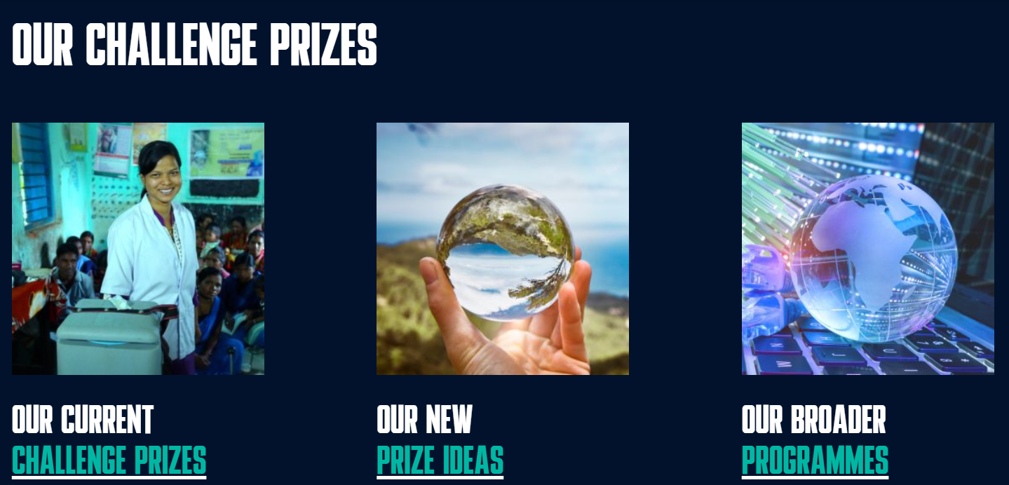
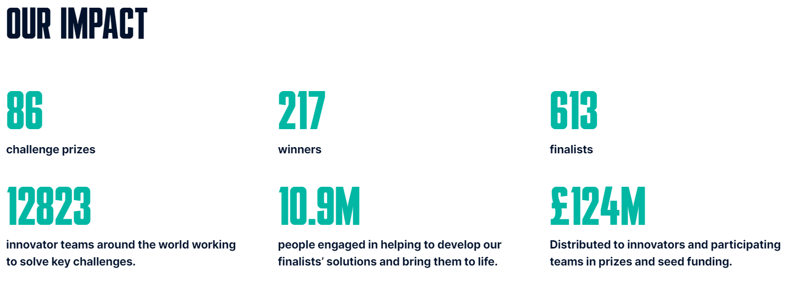
Commissioned by powerhouses like the United Nations, Challenge Works is a social enterprise transforming global issues into opportunities. Their partners pinpoint problems, and Challenge Works creates prizes to attract innovative minds eager to devise solutions. In a decade, they’ve run 86 challenges, with £215.2M in prizes.
We’ve had a long-standing relationship with Challenge Works. It all started with a buggy website that needed fixing. We made it developer and user-friendly, kept it engaging, and supported them whenever they needed us. Fast forward to more recently. Challenge Works decided to reinvent themselves.
We provided fresh website design and a rebuild as part of their rebrand. Focusing on creating a digital identity that’s all their own, beefing up security, and making the site easier to manage and even more engaging. We set it up so they can keep the content fresh without relying on external help too.
Assess
We sat down with Challenge Works after their recent rebrand. They’d created new brand guidelines to distinguish themselves from their parent company, NESTA. The next step: a total website overhaul.
Their digital world is complex. They have a main site which is a hub for driving business, sharing news and highlighting recent work. They also have individual websites for each prize they run.
With each new prize, a new website is launched. They wanted a system to create new websites swiftly and easily, all by themselves. It had to be versatile, allowing them to independently create things like campaign pages, articles, and surveys.
Challenge Works wanted their own standout look. Unique, eye-catching, all theirs. Next up was website speed. Quick loading was a must for smooth and engaging browsing, as was a light load for international audiences and areas with slower internet speeds and coverage. Finally, they wanted to enhance security to create a safe and trusted user journey.
Plan
We outlined the new site so that pages can be built with modular reusable blocks. The first step was to create wireframes. Wireframing is like creating an inventory blueprint for each area, showing what things will go in an area – like text, images and buttons. It helped Challenge Works understand how their pages should be structured and how to organise categories and tags. These are labels you can apply to a blog post to help users find related content.
Once the structural blueprint was in place, we moved to visuals. With their brand guidelines as our compass, we explored colour palettes and typography. This guided our design journey. We played “Hot or Not” with design inspirations from other sites. This input helped us create vision boards, reflecting possible design directions.
We then discussed future-proofing the website. Because we’re in for the long run, this wasn’t going to be a done-and-run exercise. Challenge Works deals with global innovators, some in remote spots. They’ll likely need multi-language sites soon. We investigated tools for easy future language additions. Anticipating the need for online surveys and questionnaires too, we explored suitable tools, focusing on scalability for their expanding needs.
Execute
Putting our plan into action, we created visual design templates for crucial pages and content spots. Website design for a social enterprise requires it all – from call-to-action buttons to contact forms. We added features like a related news section at the end of each page, to tempt visitors to stay longer and explore more.
We prioritised smooth admin work to lessen Challenge Works’ team workload too. Like building a handy feature that allows copying and pasting components between pages with just a click. Anything we could automate to make things easier; we made it happen.
Data migration
As we moved Challenge Work’s old content to the new site, we made sure the team could easily handle it. We gave them an intuitive content management system (CMS)—think of it as the ‘Mission Control’ for their website. They can add, edit, or delete content without touching any complex code. The CMS also includes security tools. Driving ongoing protection for Challenge Works’ content and users.
The devil lies in the details: the content also kept its search engine optimisation (SEO) value. We did this by preserving URL structures (basically, the web page addresses stayed organised the same way), and by registering redirects (so if someone clicked on an old link, they’d get whisked away to the right new page).
Maintain
We didn’t just launch the website and then sprint off into the sunset. We stuck around, making sure everything is running smoothly and the site is in top form.
We’re doing more than just fix problems. We provide proactive advice, video tutorials, user guides, and training sessions. With these tools in hand, they can sail through onboarding new team members and get them up to speed with the new system.
We contribute strategically too. Focusing on adapting Challenge Works’ ideas into actionable web features. There’s a dynamic back-and-forth as we bring their visions to life. We help them meet their digital objectives in this ongoing relationship.
Challenge Works now has a site that’s a breeze to handle. They can whip up new pages for fresh prizes, no need for our help. It’s fast and flexible, perfect for catching new business opportunities on the fly.
Challenge Works
Speaking to our partnership, Challenge Works shared: “The salsa to our nachos—since the grand redesign, we’ve seen a supercharged 400% improvement in page loading speeds.”
Let’s work together. Get in touch.
A full 10/10 for bookings made breezy
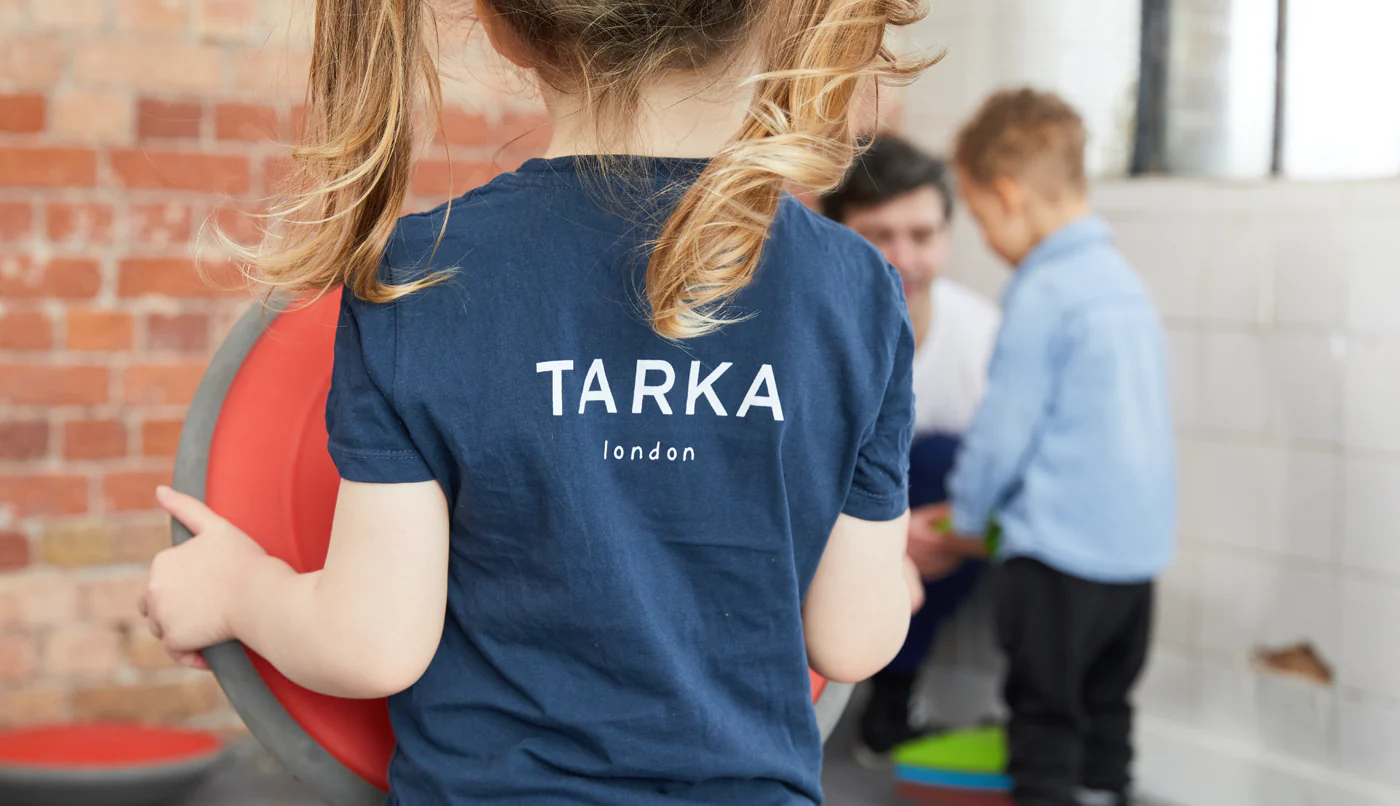
We recently revamped TARKA’s booking system, allowing parents to schedule classes with ease and saving the team time on phone bookings. We enhanced TARKA’s brand and designed and build a new website for smooth integration with the new booking system.
TARKA is a premium exercise company for children, setting the bar high in fun and fitness. Their goal is to boost kids’ overall development. They teach military values in their classes, embedding essential life skills. No uniforms needed – unless, of course, it’s army party time. Then it’s ‘Ten-hut!’
Leo Bell, Managing Director, TARKA London
We spent time understanding TARKA’s challenges, their needs for the new booking system and potential workflow improvements. Their existing site made booking classes overly complicated. Parents regularly phoned in for bookings because the system was too difficult to navigate. Staff members were spending too much time managing bookings manually.
TARKA’s brand needed a spruce-up too. The guidelines were, let’s say, ‘free-spirited’. We aimed for solid, consistent branding that not only meshed with the new booking system but also turned heads in TARKA’s crowd.
The workshop also served as a platform to talk about our collaborative process. We discussed weekly meetings with Leo, the Managing Director for regular feedback and project tracking. We also promised TARKA to be there to sort out any misunderstandings, making sure we understood each other clearly.
TARKA wanted a self-service booking system that worked hard for parents and integrated seamlessly with their website’s look and function. Our goal was to give parents a single account to book multiple classes for multiple kids.
Our top recommendation was an off-the-shelf-ish solution that offered a seamless integration via an API – a tool that lets different software systems talk to each other. It would deliver an effortless user experience for both TARKA’s team and their customers.
When we presented a couple of options, TARKA opted for the sensible budget option. The right move for them. Pembee stood out as an affordable booking system offering an integrated iFrame (a tool to display content from another site within your webpage). That meant no need for complex integration work – it just ‘works’!
Pembee fulfilled all our criteria and seamlessly matched TARKA’s website design. The only hint parents have that they’ve landed on Pembee’s platform when booking classes is the change in the web address (URL).
We gave TARKA a brand glow-up. Colour palette sorted, typography tightened, logo spruced up. And with fresh brand guidelines, the website design followed a simple and premium structure.
Tech-wise, we kept it simple with the Pembee integration. Imagine this: a gateway on TARKA’s site, guiding parents to a one-stop place to find and book classes. The design? It was so smooth, you couldn’t tell it was a portal to another site.
We also designed a custom campaign banner. TARKA could set the destination for when parents clicked on it, speeding up bookings for specific sessions, such as holiday classes.
We didn’t want TARKA to feel lost with their new content management system (CMS). So, we made an easy-to-understand CMS guide, showed them around the system, and supported them during the user acceptance testing (UAT) phase – a step where they could try out the system to make sure it met their needs and worked properly.
Revealing TARKA’s updated site and the Pembee booking system integration was just the start. Instead of wrapping up, TARKA is continuing to refine their site, which we happily do in collaboration with their marketing agency.
We’re doing the heavy lifting as their personal tech consultants, translating all the jargon into actionable insights. For example, we introduced TARKA to A/B testing. We didn’t just mention it, we explained it thoroughly – like a wine tasting but for web pages. After outlining its benefits and how it can improve landing page results, we gave hands-on demos of the best tools for it, a practical lesson without any dull PowerPoint slides.
Leo Bell, Managing Director, TARKA London
TARKA is already celebrating victories post-launch. With parents taking full advantage of the self-booking system, the phone lines are blissfully manageable.
The website is smoother and more welcoming too. We put the site through the digital equivalent of TARKA’s boot-camp workouts for kids and found that mobile performance sprinted ahead with a relative increase of 93.18%. Critical for the busy parents who book classes on-the-go. Meanwhile, the desktop experience increased by 18.53%, and accessibility leaped up by 48.08%.
Leo Bell, Managing Director, TARKA London
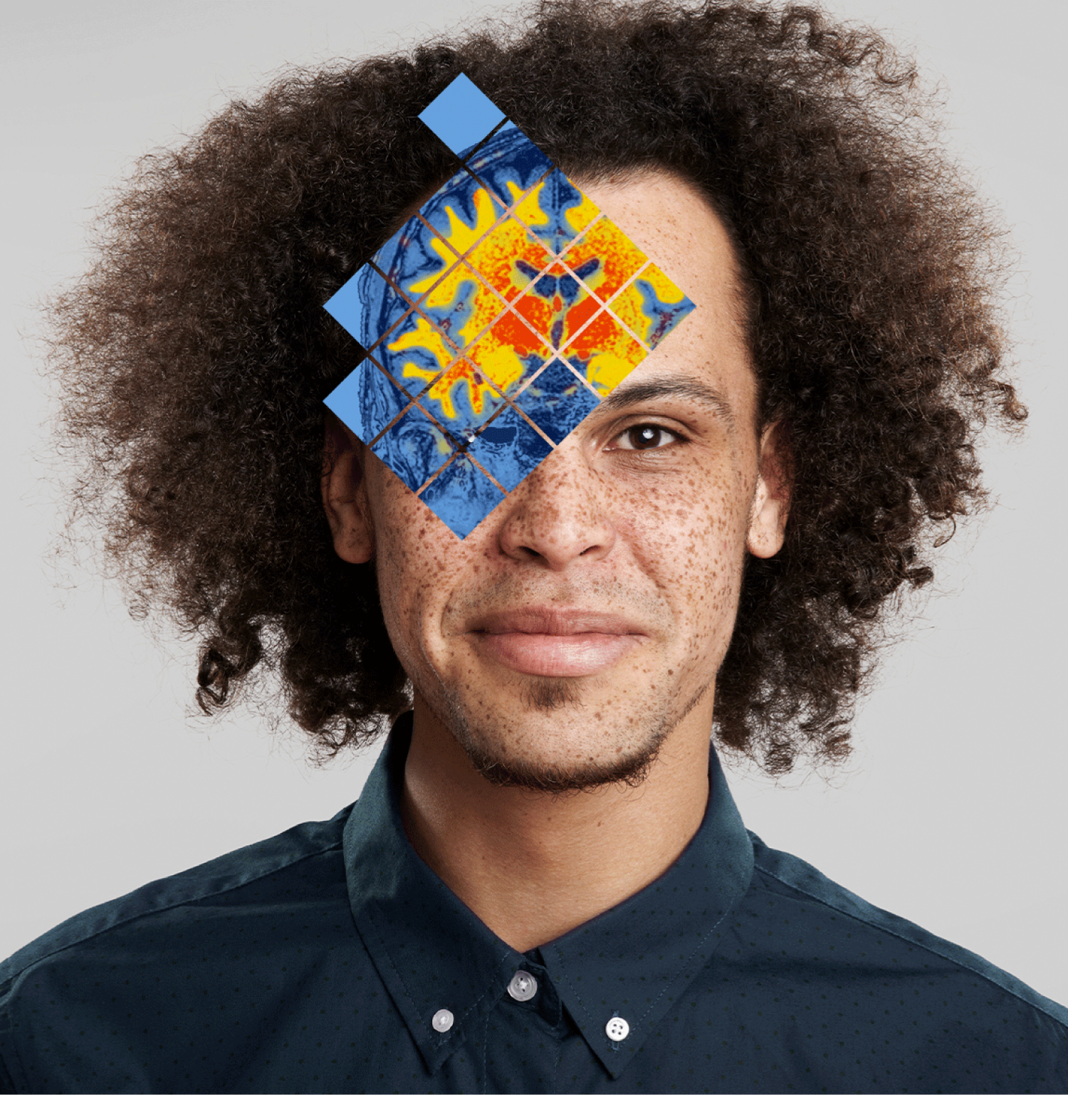
Quibim, a cutting-edge med-tech firm, uses Artificial Intelligence (AI) to decode intricate medical imagery. They’re the Sherlock Holmes of the medical world, interpreting the mysteries of X-rays, MRI scans and beyond. They transform these insights into precision diagnoses. Delivering essential knowledge that paves the way for life-saving medical decisions.
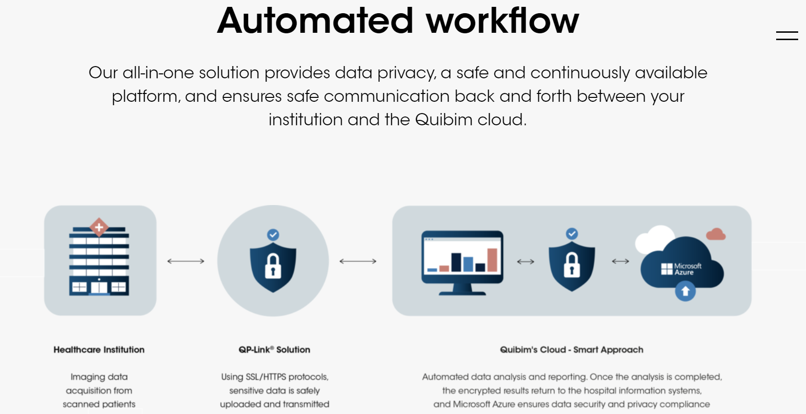
Quibim’s website just had a complete Telescopic overhaul, capturing the essence of this forward-thinking, people-centric med-tech company. With a perfectly shaped custom configured content management system (CMS), we handed Quibim the reins of their content. And wait till you hear about the cunning plan we hatched to shift their blog content without a hitch.
Assess
We spent time understanding Quibim, their audience, goals, and website challenges. Their old site didn’t reflect Quibim’s advancements in AI-driven medical imaging. Our key objective? To design a fresh, flexible website that communicates their expertise and influence in the industry. It also needed to emphasise their human-first approach. Driving trust and connection, while making them appealing to investors.
As a rapidly evolving company like Quibim, they also needed a site that could be easily updated by their internal team of creatives and marketers. They had a wealth of blog content too. The content required secure migration to the new site, while retaining search engine optimisation (SEO) value.
Plan
Quibim set us a one-month deadline for the website project. One month? Sounds like a walk in the park… if the park was filled with tightropes and fire-breathing dragons. But hey, we love a good challenge.
To launch the website swiftly, we chose the essential pages to build first in phase one of the project. Our plan was to incorporate dynamic visuals and improve the user experience (UX) for a living, high-tech feel. We also decided on WordPress, an open-source content management system (CMS), to build a flexible website.
For the content migration, we planned to automate most of the process, reserving the manual effort for the spotlight pages. The content migration strategy also included automatically assigning 301 redirects for search engines to make sure Quibim’s SEO value stayed rock solid.
Execute
Our digital design infused life into Quibim’s homepage. We introduced several dynamic elements to the site: videos featuring people, code-driven animations and subtle scroll-activated elements. This blend of media, set against a shifting dark blue gradient, brought the science of their work to the forefront while keeping the human imagery intact. Enhancing the overall site appeal and preventing it from feeling too static.
The design and build were approached in a modular way using WordPress real time preview editor – each content element was crafted as an individual, bespoke module. These modules can be arranged in any order to form a page, giving Quibim the freedom to easily update or create pages. This way, Quibim was freed from “developer dependency disorder”.
As we shifted to a new content management system (CMS), we automated the transition for most blog posts and news updates. Key pages received manual attention. Each chunk of content was carefully moved from its old home to a new module on the revamped site. We also set down 301 redirects. They guided search engines from old web pages to new ones. This made sure none of that hard-earned SEO juice got lost during the site move.
Maintain
Think of us as the mechanic to Quibim’s high-performance sports car. We’re always on hand, fine-tuning their website engine after launch. And making sure it doesn’t stall on the digital highway.
But that’s not where the collaboration ends. When Quibim has a spark of a new idea or a request for changes to the site, we don’t just hop to it. We hit the pause button, huddle up and brainstorm. Our goal is to find the smartest way forward, not just the quickest. Once we’re loaded up with fresh ideas, potential tweaks, and a buffet of solutions, we take it back to Quibim.
This is a dialogue, not a monologue. We’re working with a mix of creative folks and project managers, so clear, accessible communication is key. We lay out the different paths, required resources, and our recommended route. This way, we all stay on the same page, handcrafting the most polished digital reflection of Quibim together.
Quibim’s new website echoes the progressive company they’ve grown into. It’s a head-turner for their current investors and siren call for future ones. But wait, there’s more … cue infomercial music.
Before Quibim’s website’s revamp, it was scoring just 18% for mobile performance and 56% for desktop. Accessibility? An average 57%. Post-makeover, the change was clear.
Mobile performance saw a significant increase of 47%, and desktop performance rose by 29%. Accessibility also experienced a 17% improvement. The new Quibim site doesn’t just look good, it’s now a lightning-fast, user-friendly platform.
Remember, users form an opinion about a site in a mere 0.05 seconds. And almost half will bail if a page takes more than two seconds to load. So, these improvements aren’t just stats. They mirror a satisfying user experience that matches Quibim’s high-tech ethos.
Quibim’s new website is also more sustainable, producing only 0.15g of CO2 each time someone visits the home page. That’s way less than the 1.76g most pages churn out. So, while maintaining Quibim’s tech-savvy and scientific vibe, we’ve crafted a site that’s not just user-friendly but planet-friendly too.
Let’s work together. Get in touch.
British Fencing (BF) is the National Governing Body for the Olympic and Paralympic Sport of fencing. It serves the wider BF community — fencing athletes, clubs, coaches, referees and countless volunteers.
BF believes that fencing is for everyone. It’s focused on making the sport more accessible, inclusive and diverse. For instance, it collaborates with schools, learning centres and other activity venues. Together they’re introducing kids to fencing who would have otherwise struggled to engage with the sport. They benefit from gaining new skills, building their confidence and learning how to think independently. In this sense, fencing helps them deal with life’s challenges and be happier individuals. It’s one of the many ways BF is driving social change through its programmes.
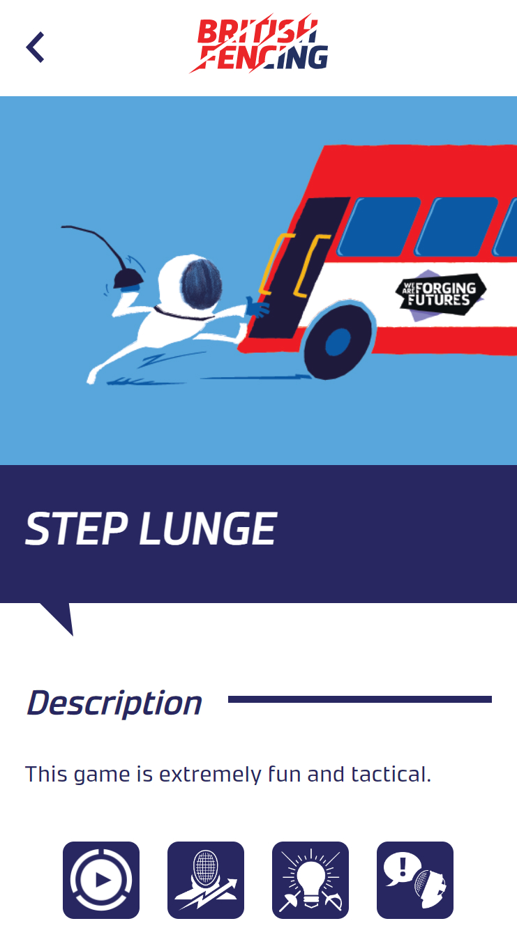
British Fencing engaged with us in March 2020 looking for help with an app — Explore Fencing. The product had been started by another agency before we arrived on the scene.
The Explore Fencing App was supposed to be a free-to-download interactive asset. One of its purposes was to introduce fencing to beginners through fun games. Each game would come with a description, a how-to guide and a video showing users how to fence. It would be an engaging way to make the sport less daunting and more accessible for those interested, while supporting community fencing coaches’ onward delivery to over 250,000 unique fencing participants each year.
The app was also designed for BF’s Licensed Partner Programme and their coaches, such as activity centres like Centre Parcs or We Are Forging Futures schools. Their version would be paid and they’d get access to premium content, such as teaching materials. Coaches would also have the ability to tailor the content for their uses. This was how BF intended to commercialise the app – by distributing paid-for content.
But the app wasn’t fit for purpose. As James Craig, Commercial Director explains, “From a backend perspective, it was buggy and inefficient. Simple actions, such as adding new content to the system, were extremely time-consuming. We weren’t as concerned with the frontend, but it wasn’t as modern as we had hoped.”
BF needed help fixing the app to make it publishable in iOS and Android app stores. To turn the product into a valuable asset, we first explained our plan. It was approved and we launched into action.
The code was riddled with bugs. We addressed them first-, so the app worked for all users. No more error messages or searching for fixes and workarounds. With a better, bug-free code, the user experience at both ends became seamless.
Then we rebuilt the app with a monorepo — one efficient code source for different platforms. Not only could BF now publish in iOS and Android app stores but it could deploy the app for the web. This new functionality enabled classroom use, further adding to its value.
Click here to check out the Explore Fencing app
We also helped BF with things like manual data imports. For instance, previously it would take app administrators dozens of clicks just to create a new user and assign them to games. Now it takes three.
We turned the app into a mature product. But our work wasn’t over. BF needed to easily create, edit and publish content on the Explore Fencing App. An effective content management system (CMS) would generate a new revenue stream for BF through paid-for content that was valuable to fencing coaches.
There was an existing function for this purpose – a .exe packaged windows application. It was tedious to use. Initially, we helped BF navigate it as best we could. But every time we encountered a bug that needed fixing, another would appear, so we made the mutual decision to build an online CMS.
Now, things like drag-and-drop functions and shared online access mean users can easily manage and distribute content. It also lets coaches add, edit and publish content, facilitating a more personalised experience. On top of the online CMS, we’re also making the app API-ready which opens up the future for exciting developments.
The Explore Fencing app project marked the beginning of a new partnership. To kickstart a rewarding relationship, we hosted a workshop with BF to assess its digital estate, how it operates and the types of systems it’s using. We’ll also build on our knowledge of BF’s purpose and long-term goals. From this, we’ll create a practical digital roadmap on how to help our client grow and improve. And, as always, we’ll explain the WHY behind our recommendations, keeping them fully informed every step of the way.
We’ll take the fluffy bits of a digital strategy and help implement it with practical no-nonsense solutions.
BF clicked with us, as James puts it:
“Telescopic went above and beyond the original scope,” James says. “I think that’s their default. Even if they finish something ahead of schedule, they’d be proactive in saying: Is there anything else we can help with? It’s not often you get to work with people so committed and proactive.
“The team is also very diligent,” continues James. “They use quality software for communication and always get back to you quickly. We were never left wondering what was happening with the project. And crucially, they put the effort in to make sure you understand the technical side of things. There wasn’t anything we didn’t get or weren’t prepared for.”
Watch the video below for more insight into James’ experience working with Telescopic.
Technology doesn’t have to be your forte. You can still wield it like an Olympian fencer with expert support. Sharpen your competitive edge and drive growth by engaging with us. (Ok, we’re going to stop now.)
We’ll connect you with tech that serves you and secures your success.
Call us on 02036331575 or email us at hello@wearetelescopic.co.uk.